The drawings, paintings and illustrations of Viggo Balder Andersen.
This page works like a timeline of my work where you can witness my achievements and skills grow and improve like a vast world of imagination!
Contact information
Ta kontakt:Viggo-balder@hotmail.com
torsdag 31. januar 2013
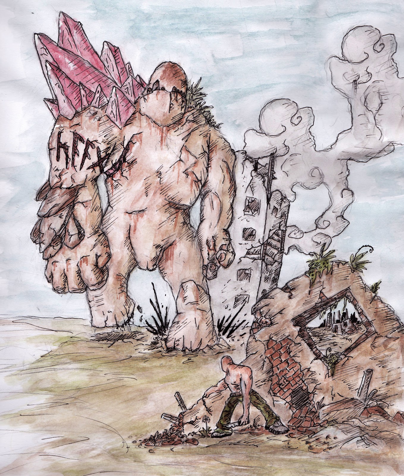
Sketch illustrating a creature from an oil painting I have planned out.
I call the upcoming painting "abyssi sonos" (The deep sounds) and hopefully it will be a my first gem.
onsdag 30. januar 2013
First Oil painting results.
Today my teacher suggested I try out oil painting for this project and so here is my very first attempts at learning this new medium.
I had no idea oil paint was so different from acrylics and I can't wait to get some more time alone to experiment and experience this mysterious paint.
mandag 28. januar 2013
A magazine illustration for a project on horror.
I am not completely satisfied with this one so I will try to make one or two new illustrations with the same technique: 2B pencil, watercolor, ink and photoshop.
fredag 25. januar 2013
Fist sketch of a magazine cover assignment.
My tiny study of pigs have had a big impact lately.
tirsdag 22. januar 2013
Started a new exiting project in school where I pretend to draw for magazines, here is a taste of what I have in mind so far.
mandag 21. januar 2013
A sketch after doing some pig studies, I feel this technique / style is really what I need to improve, perhaps not even improve but combine with watercolor or ink.
onsdag 16. januar 2013
A quick concept for something I might get more into later.
lørdag 12. januar 2013
A pretty huge dragon sketch, a shame I drew this on normal paper, if I had done this on watercolor paper I could have had a pretty cool piece to experiment with.
onsdag 9. januar 2013
Trying to get more contrast and life into my watercolor, I actually like the expression in this piece, using more layers of paint and just a sketch to begin with.
If I had done the sketch itself all done and clean first this could have been a pretty nice concept I think.
So close to what I want to be able to create now, I can feel it and see it.
lørdag 5. januar 2013
I colored and inked the sketch, not the best watercolor paper but the result was not too bad.
I still need to focus on contrasts in my coloring but this is not too bad I think.
A little more practice at this style and I could hopefully make marvels pretty soon.
fredag 4. januar 2013
Another character concept with a short list of names.
This is a marauder; The marauders are orc-like creatures who once were humans exposed to radioactivity, they were driven down under ground by normal men where they lived in caves sealed in complete darkness where evolution quickly changed them. Immune to radiation, able to see in the night, great smell and hearing and suited with great strength and thick skin the underground tribes have become powerful warriors of rage.
I had lots of fun drawing this one hour sketch.
If I decide to ink this digitally I will defiantly go deeper into detail but for now here is the latest conceptual sketch.
Now I'm getting close, something weird is still going on especially around the upper arms and feet but this is so close to what I wish to achieve that I think within a few days of hard work I am ready to jump more into costume and details of the style.
Another character full of mistakes BUT also full of improvements.
I become more and more aware of things like feet and hands, shape and pose and negative space also my technique is become even more solid with more depth and dimention.
More concepts.
Even with all the mistakes in this sketch I see improvements, the style is getting more solid by the day.
tirsdag 1. januar 2013
Some warmup sketches of a hero and a bunch of sand pirate orc mutant things.
I think I'll continue working on that hero, see what I end up with.
A quick sketch where I mainly focused on the shoulder gear, head and overall expression.
The legs, feet and hands are obviously the things I need to focus on in character design so that I can do quick sketches like this without those elements ruining it.
To make this sketch complete I would have to spend more time on it.
My first sketch in 2013.
I tried to add perspective here and tho I made a few mistakes (the left leg is too short and low down to fit the other leg) I think this could become a cool pinup poster with some digital inking and final editing.
My second one perspective sketch.
This one I tried to simplify a little by adding less and clearer details, I think this makes the illustration easier to paint in watercolor and ink.